
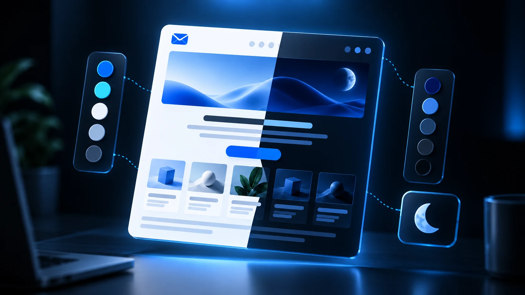
Tailwind email dark mode works by compiling dark: utilities into conditional CSS, but email clients do not share one dark-mode behavior.
Some honor prefers-color-scheme, some use client-specific selectors, some automatically transform colors, and some keep the light design. Build an explicit light baseline, add dark mode as enhancement, and test the delivered message.
Start with explicit light colors
Do not leave important surfaces transparent and hope clients infer the right result.
<div class="bg-white px-8 py-10 text-slate-950 dark:bg-slate-900 dark:text-white">
  <h1 class="text-3xl font-bold">Your report is ready</h1>
  <p class="mt-4 text-slate-600 dark:text-slate-300">
    Review the latest activity.
  </p>
</div>
The unprefixed utilities create the baseline. Dark utilities should remain inside conditional CSS after compilation.
Do not inline dark variants
dark:bg-slate-900 is conditional. Inlining that background directly would make every recipient see the dark design.
The compiler should:
- inline
bg-whiteandtext-slate-950; - keep a selector for the dark variant;
- preserve a supported dark-mode media query;
- retain or normalize targeted class names; and
- leave the light version complete.
Understand the three dark-mode outcomes
Full support
The client applies your dark-mode rules as intended.
Automatic transformation
The client changes some backgrounds and text colors even if you supplied no matching rule.
No transformation
The client displays the explicit light design.
Your template needs acceptable contrast in all three.
Choose colors by role
Define pairs for:
- canvas;
- surface;
- strong text;
- muted text;
- borders;
- links;
- primary button;
- success, warning, and danger states.
Avoid a one-to-one inversion of every color. Dark surfaces often need slightly lighter muted text and lower-contrast borders than a mechanical inversion produces.
Protect logos and images
A dark logo on transparent pixels can disappear on a dark surface.
Options include:
- a logo with a neutral container;
- a version designed for both backgrounds;
- a light and dark image switched with tested CSS; or
- a mark with a subtle keyline.
Do not duplicate large hero images only for theme. That increases HTML and asset complexity.
Buttons in dark mode
Keep the primary action recognizable even if a client changes surrounding colors.
Use:
- explicit cell background;
- explicit link color;
- sufficient contrast in both themes;
- table-backed structure for Outlook; and
- a label that makes sense without color.
Test whether the client transforms the button while leaving the text unchanged.
Borders and muted text
Dark-mode failures often hide in secondary elements:
- dividers disappear;
- muted copy becomes too dim;
- cards blend into the canvas;
- links lose distinction; or
- disabled-looking colors are used for required legal content.
Review the full email, not only the hero.
Tailwind dark-mode example
<div class="bg-slate-100 p-5 dark:bg-slate-950">
  <div class="rounded-xl border border-slate-200 bg-white p-8 dark:border-slate-700 dark:bg-slate-900">
    <h1 class="text-2xl font-bold text-slate-950 dark:text-white">
      Payment received
    </h1>
    <p class="mt-4 text-base leading-7 text-slate-600 dark:text-slate-300">
      We received your payment of $48.00.
    </p>
  </div>
</div>
Keep the property set simple. Complex gradients, blend modes, masks, and filters make client differences harder to predict.
Add email-client metadata carefully
Some clients respond to color-scheme metadata. Include it only as part of a tested dark-mode implementation, because declaring support can change how a client treats the message.
Document which clients and versions were tested and when.
Test matrix
Check:
- Gmail web and mobile;
- Outlook desktop and web;
- Apple Mail and iPhone;
- system light and dark settings;
- images enabled and blocked;
- automatic inversion behavior;
- logo visibility;
- button contrast;
- muted text and borders; and
- screenshots at narrow and wide widths.
Use Tailwind email compatibility as the broader baseline.
Common mistakes
Depending on dark mode
The light baseline must always work.
Using transparent logos without a plan
Add a neutral backing surface or theme-safe asset.
Inlining dark: styles
Conditional styles must remain conditional.
Testing only Apple Mail
Apple Mail's broad support does not predict automatic transformations elsewhere.
Forgetting generated states
Test alerts, buttons, receipts, and legal copy not only the default card.
Frequently asked questions
Does Gmail support email dark mode?
Gmail provides dark experiences, but exact color handling varies by platform. Test web and mobile separately.
Does Outlook support prefers-color-scheme?
Support varies across Outlook products. Keep the light baseline strong and test the versions relevant to your audience.
Can I use Tailwind's dark: prefix?
Yes, if your email compiler preserves it as supported conditional CSS and retains the selector it targets.
Should I create two emails?
Usually no. One accessible message with progressive dark styles is easier to maintain than duplicated light and dark markup.
Dark mode is progressive enhancement
A robust dark-mode email is not one that forces every client into the same palette. It is one that stays readable under client-controlled transformations.
Use explicit light colors, a restrained dark palette, resilient assets, and real inbox testing. Tailwind makes the source concise; compatibility comes from the compiled CSS and fallback design.
Share with friends