
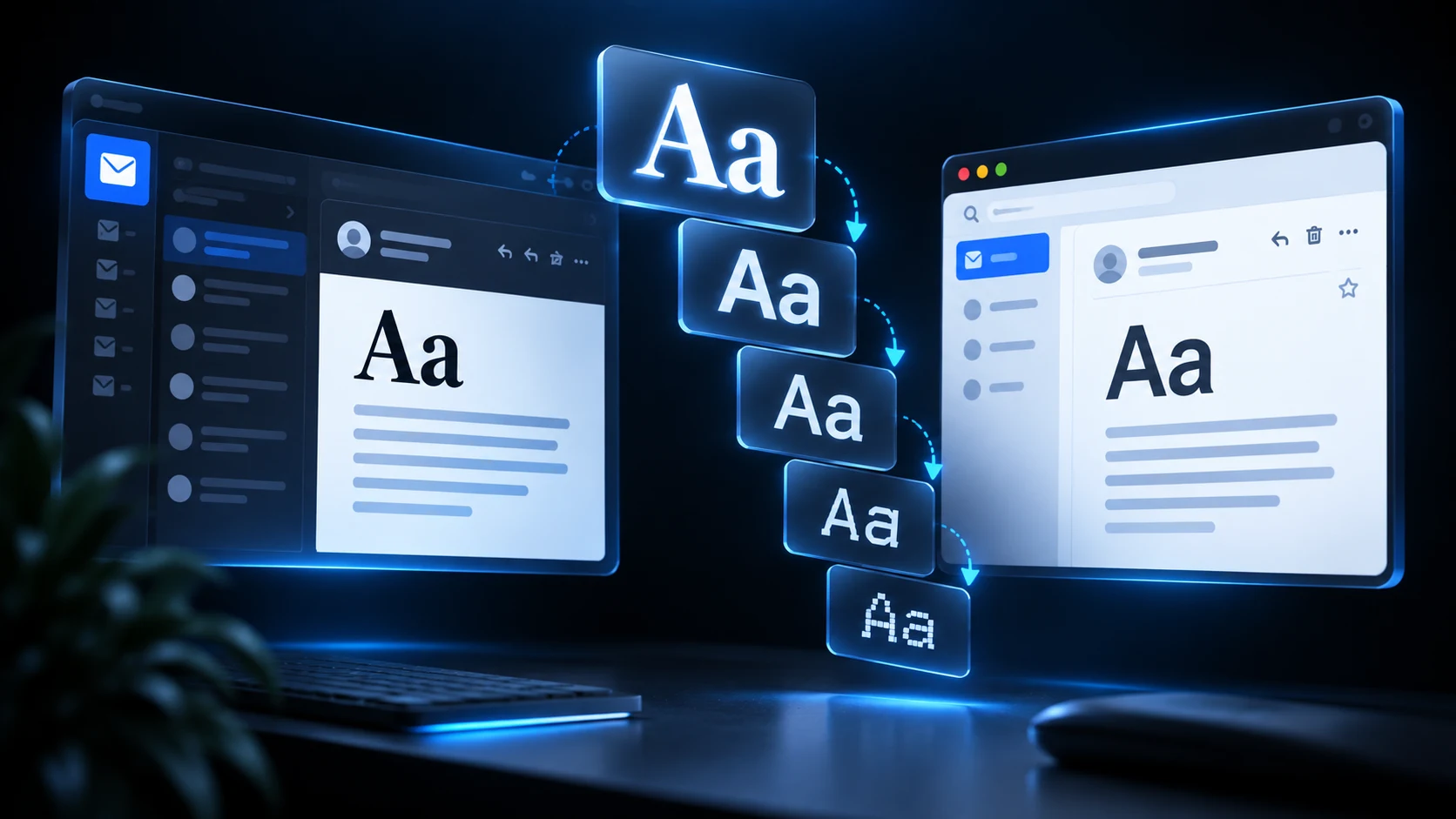
You can use web fonts in HTML email, but they should be treated as an enhancement not a requirement. The reliable approach is to define a system-font fallback stack, apply it inline, and load the custom font only for clients that support it. Your message must still look intentional when Outlook, Gmail, or a privacy setting blocks the font.
The safest font strategy for email
Email typography has three layers:
- A primary web font for clients that can download it.
- A close fallback font already installed on the device.
- A generic family such as
sans-serifas the final safety net.
For a geometric font like Inter, a practical stack is:
<td style="font-family: Inter, Arial, Helvetica, sans-serif;">
  Your account is ready.
</td>
In Tailwind source, the same decision can live in an arbitrary value:
<td class="font-[Inter,Arial,Helvetica,sans-serif] text-[16px] leading-[24px] text-slate-700">
  Your account is ready.
</td>
The production step should inline those declarations. Read our CSS inlining guide if you are deciding where that transformation belongs.
Which email clients support web fonts?
Support is uneven and can change by application, operating system, and account type. Apple Mail is generally friendly to web fonts. Gmail and many Outlook environments commonly fall back to installed fonts. That is why a compatibility table alone should not determine your design.
Use a web font when it reinforces the brand, but make every spacing decision against the fallback too. A fallback can be wider or taller than the preferred face, changing line breaks, button widths, and card heights.
Load a web font progressively
A common pattern places a hosted font declaration in the document head:
<style>
  @font-face {
    font-family: 'Inter';
    font-style: normal;
    font-weight: 400;
    src: url('https://cdn.example.com/fonts/inter-regular.woff2') format('woff2');
  }
</style>
Then apply a complete inline stack to every relevant text container. Do not rely on inherited typography alone; email clients may move or remove styles as they process the message.
Keep the font files on a stable HTTPS host with correct CORS and content-type headers. Avoid loading more weights than you need. Each extra request adds another possible failure and can delay rendering.
Protect Outlook from font substitutions
Some desktop Outlook versions may render unsupported custom fonts with an unexpected serif face instead of the fallback you intended. A Microsoft-specific conditional block can force a dependable family:
<!--[if mso]>
<style>
  table, td, a, p, h1, h2 {
    font-family: Arial, Helvetica, sans-serif !important;
  }
</style>
<![endif]-->
This does not make Outlook load the web font. It gives Outlook a deliberate fallback. Combine it with the structural fixes in our Outlook compatibility guide.
Use explicit email typography
Browser defaults are not safe design tokens. Set font-family, font-size, font-weight, line-height, and color deliberately. Pixel values are predictable for critical email type. A readable body treatment might be 16px with a 24px line height.
<p class="m-0 font-[Arial,Helvetica,sans-serif] text-[16px] font-normal leading-[24px] text-slate-600">
  We’ll send a reminder before your trial ends.
</p>
When composing reusable blocks, make typography part of each component’s contract rather than depending on a distant wrapper. See Tailwind email components for a scalable pattern.
Match fallbacks by shape, not reputation
Choose a fallback with similar letter width and x-height. A condensed brand font paired with wide Arial may create very different wraps. Test the longest heading, translated button labels, prices, narrow mobile widths, and increased text sizes.
Avoid using images for headings simply to preserve a typeface. Image-based text is less accessible, harder to personalize, and may disappear when images are blocked.
Common font mistakes
Using only the custom family. If it fails, the client chooses the substitute.
Loading five font weights. The visual gain rarely justifies the requests and file weight.
Assuming bold synthesis is identical. Verify the fallback’s bold style.
Forgetting line-height. Default line spacing varies between clients.
Testing only with the font cached. A warm browser preview hides the fallback experience.
A practical decision rule
Use a system stack for transactional messages where speed and predictability dominate. Add one branded web font for marketing messages when the identity benefit is meaningful. In both cases, approve the design while the web font is disabled.
Frequently asked questions
Does Gmail support web fonts in email?
Do not depend on Gmail downloading an arbitrary hosted font. Supply a strong fallback stack and regard any custom-font render as progressive enhancement.
Can Tailwind make a web font email-safe?
Tailwind makes typography easier to author, but it cannot change client support. Your build process must inline the fallback stack and preserve supported @font-face rules.
What is the safest email font?
Arial, Helvetica, Georgia, Times New Roman, Verdana, and system UI fonts are common choices. “Safest” means installed and readable across the devices your audience uses, not identical everywhere.
Should email font sizes use pixels or rems?
Pixels are usually more predictable in email. Accessibility still depends on readable sizes, good contrast, and a layout that tolerates zoom.
Share with friends